
I take a personal interest in fast running ecommerce installations. I love it when you can click through an online shop as if it were hosted on your own hard drive and lucky for a guy like me – the industry has been moving in the same direction. I mean, Google and customers alike favor fast loading pages, so why shouldn’t you be interested in this?
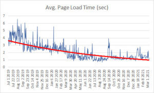
It should not surprise anyone that when our client Jewellerybox.co.uk started tracking their competitiveness, I jumped at the opportunity to improve their position. Four months later and we have reached the top for all fashion stores in the UK, top 10 overall and got a decent 90+ desktop & 70+ mobile score on Google PageSpeed. It’s been a rocky path with many setbacks. And so I figured I’d start a small series of blogposts that dig deeper into all the optimizations we did to achieve this goal.
TL;DR: To see all changes at a glance, check our “Web Performance Tuning Checklist 2021“
The Basics
Let’s start with the basics: website performance is usually measured across multiple key metrics. Google refers to these key performance indicators as “Core Web Vitals”. You can argue about the usefulness of each, but they are quite helpful to understand how your website loads. Here’s a quick overview of what is measured:
- Largest Contentful Paint (LCP)
How fast does your website load (this should be within 2.5s) - First Input Delay (FID)
How quickly can users interact (this should be less than 100ms) - First Contentful Paint (FCP)
How long does it take until the first block of content is visible to the user (This should be within 1.5s) - Cumulative Layout Shift (CLS)
How long does your website shift around while rendering (this should be less than 0.1)
There are additional KPIs that should be of interest to you:
- Time to first byte (TTFB)
How long since the user requested the page until the server sends something - Total Blocking Time (TBT)
How long a page is blocked from responding to user input
Additional measurements can be interesting, too, but usually when you optimize for all of the above, you will automatically optimize the others. In fact, most of what you do will have some relevance to other key indicators.
You have to be aware that Google’s PageSpeed and Lighthouse will differentiate the core web vitals for desktop and mobile users, and they will assume that a very old and slow mobile device and internet connection will be used for the rendering. You should also keep in mind, that all tools are unprecise and you should be with the tool your choose. We opted for creating an average out of multiple Pagespeed calls and only cross-checked with Lighthouse in case we’d miss something.
 Most websites tend to optimize for desktop because it is easier to achieve a yellow and green rating. That is a mistake – aim for a decent mobile rating. You will only need to work on some CLS optimizations for desktop afterwards. Perhaps I should also mention consistency in testing here: Lighthouse vs. pagespeed vs. GTMetrix or Webpagespeed test – you have to make up your mind on how you test, and keep up analysing your page over a longer period.
Where do you start?
At Jewellerybox we decided to look at LCP and TTFB first and focused on the frontpage, before moving over to category and product pages. PageSpeed/Lighthouse gave us a score of 55+ for desktop and a really poor 30+ for mobile and a quick view at the browser developer tools suggested an average TTFB of ~600-800ms. Okay, but not great. Google also complained about unoptimized image sizes and compression, unused Javascript, blocking Javascript, excessive DOM size, inefficient cache policy on static assets and more.
Most of those would be tricky, but for LCP and TTFB there’s a range of options. We’d start here and FCP, FID and CLS would follow later.
Things we had already done
Some things we had already done before we went on this adventure. Among them were:
- Minify CSS and Javascript files
- Enable HTTP/2 loading for all ressources
- Use an CDN for our images
- Prepared images in different sizes
As an indicator I will add “points” to each optimization category, which give you a rough estimate on how much our Pagespeed score improved due to the changes.
The Optimizations
Cache everything (+10 Points)
To take measures, it is necessary to understand how your performance comes to be. We knew that the page was held back by some poor performing service calls that determined the in-stock availability of products (and in turn sets a range of labels), but those were difficult to improve. So we opted to introduce additional caches, which we added across various areas of the code. Our very own Scipio ERP already comes with server-side caching functions, but we introduced additional caches regardless.
Now, as a developer, I always feel that if you rely on caches, your code is simply not optimized. Which is true, but that shouldn’t let you shy away from using caches wherever you can. We reviewed our code and made better use of database-caches, added caches to service calls (if the context is the same, why bother with calling the process again?) and also added a new frontend based cache, which is now part of the Scipio framework and can be used to wrap partial sections of HTML. We later also added events that could clear individual caches, so that these would not become stale if our client updated certain information.
With these changes, and some additional code improvements, we reduced our page rendering time to an average of 150ms. PageSpeed approved and pushed us in a constant yellow range for desktop (mobile remained roughly the same).
Setup SSL & webserver configuration (+5 Points)
After rolling out our first set of changes, we noticed that our production results were worse than anything we’d encounter on our developer environments. Our monitoring service would also at times report long SSL-handshake responses. So we looked at how the browser connects to static assets and how connections themselves were handled.
On the webserver-side we optimized the following:
- Added Brotli and gzip compression (though this was superfluous as we also used Cloudflare for most static files)
- Introduced Glusterfs, so we could synchronize static files across our webservers and reference them statically, rather than through the application servers
- Add appropriate cache headers to all static files and added file system caches
- Optimized load balancing and changed servers to use round-robin on static file requests
- Optimized SSL cipher configuration and buffer sizes
After, unsuccessfully, trying to introduce an SSL session cache, we had a very friendly exchange with the guys Blackbird, who pointed us to an article on Extendend Validation Certificates. The article suggests that these may not only be not be beneficial to your customers anymore, but the additional processing time needed to decipher each request may in fact be slowing you down. We replaced our certificate for a much cheaper SSL certificate and instantly improved our load times by another 50-120ms.
Optimize your images (+5 Points)
Serving clients appropriate image sizes is one of those topics that sounds easy on paper and becomes nail bitingly frustrating really quick. The idea behind it is clever: you should build a website in such a way that each device loads an appropriately sized image. The worse your image size and compression, the longer it takes for the browser to load the image and the worse your LCP score. Great. What no one tells you is that responsive design, customizable layouts and images still don’t play well together. Your server-side rendered HTML does not know which display size it will end up on but you should give it an ideal image file for a piece of html that could be different widths. Add to that different image formats that only some browsers support, like WebP, and you have a very complex set of requirements.
The standard img tag alone can’t do all that, which is why in recent years, the picture tag and the srcset attribute were added to the HTML definition. It allows you to define media queries and viewports, which in combination make the browser select the proper image for you. So, we introduced a new image converter, which would rescale and use the tinypng API (subscribe, they are worth it), to redo all of our images. A CDN could do a similar job, but we figured that having some further control over the images would allow us to do more enhancements later on, which we did by adding our own WebP converter.
Modern images
What nobody tells you is that that even though you “can” define viewports, sizes and WebP images to be served through a single tag, it doesn’t make it very easy to use. This is what the result looked like:
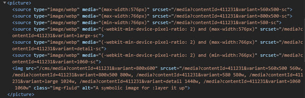
Confused yet? Me, too. And so were our editors when we showed them this grand new feature. To solve this problem, we introduced a new way that would automatically detect the content position and preselect a range of appropriate image sizes based on the wrapping element that the image was contained in. We’d hide the code for it behind an input field, so that none of our editors would ever have to worry about screen sizes, resolutions and WebP.
The result of this personal headache is a rather flexible image code that will serve differently sized images in appropriate file formats for different browsers while still having a good fallback for old browsers. It is important to add that the browser will only load one image file from this long list of files and therefore improving your web vitals.
Be smart about lazy-loading (+5 Points)
So far most of our focus had been on server-side rendering, but the clients themselves can boost web vital score as well. It is here that your optimization starts to touch on CLS and other metrics as well. You want to encourage the browsers to render anything that is first seen by the client first and render as much as possible later in the process.
“Lazy-loading” is key but loading everything lazily is no good either – I learned that the hard way. Remember the bit about wanting to encourage browsers to render something prior to the rest from a second ago? Yeah, it matters. In practice that means that you want to predefine elements that are rendered as is, while for others you want to apply lazy loading techniques. As browsers are slow to introduce native lazy loading, you are forced to define most of this yourself. For us that meant that we introduced a predefined set of images per page template which we render directly, while any image that follows will receive the lazy loading classes that trigger lazy-loading. We reused the macros we had introduced earlier for this – so time saved.
But for the remainder of the page we had to go further. Here’s a complete list of changes we applied:
- Separated Javascript and CSS files into chunks & added new code that would detect and lazy load both on demand
- Added lazy loading to our chat widget, triggered on click of the chat symbol
- Added lazy loading to all SVGs
- Added lazy loading to FontAwesome (which can easily take a whopping 500kb and takes a long time to process)
- Changed our Zoom-Image javascript to load on hover/touch
Use defer & preload (+5 Points)
Browsers offer additional ways to give it hints about things you will ask them to do in a bit or things it can do later. Defer a file to load later in the process, make it independent by loading it asynchronously, or tell the browser to pre-load a file to have it faster. All of these hints can be added to CSS, JS and font files and can be great to optimize page rendering times. For us the following worked well:
- Preloading of the default fonts
- Preloading of iconset SVGs
- Preconnecting to external domains we are depending on (analytics, cloudflare)
- DNS-prefetch of domains we might use in elements later
- Asynchronous loading of our main CSS file (we used a trick here to achieve this), the strictly critical CSS is inline
- Moved our central Javascript file to the footer
The logic here is that we want to load or open connections to as many resources as needed on page, but give preference to those that will be needed in the first (visible) section of the page over the rest.
On a sidenote: we noticed that we could improve our score a tiny bit by having jQuery be served via our CDN which was quicker than the Google CDN for this! (Ideally you’d want to get rid of jQuery entirely nowadays, but we aren’t there yet…)
Optimize your fonts (+3 Points)
We stumbled upon great article on how much performance can improve by optimizing your fonts. We played around with various scenarios and came up with the following improvements:
- Added woff2 to all fonts
- Removed unused fonts
- Replaced a duplicate reference to a font in two different weights with a single entry (the browser doesn’t need the additional font per se to render the weight, and even though there was a slight difference, no one noticed that we made this change)
- Merged often used FontAwesome icons in a new SVGs, so that the same file could be referenced (we optimized the SVGs here too)
Reduce your DOM size (+2 Points)
A browser will take time to render elements and apply CSS. The more complex the structure, and the more generic the styling, the longer it takes to render, often resulting in very visible layout shifts. This is punished by Google, as it directly influences what users see and what elements they can interact with. Both CLS and FID are affected.
We optimized our classes and reduced duplicates where possible. We also added new subtask to our CSS minifier that would merge the code for us, so that media queries wouldn’t need to be across multiple definitions.
Apart from this, we re-evaluated each DOM element. We are using Bootstrap 4 for this project which has a rather large HTML structure per element itself and has a large CSS footprint. Which is why we think newer alternatives like Tailwind may be great for a future project. But we had to deal with what we have, so instead we began to remove duplicate wrapping elements wherever possible.
Optimize your critical CSS (+10 points)
This was a large boost, but one that came late in the game for us. After having optimized page rendering, we were still left with a poor CLS rating. CLS is a measurement of visual shifts of elements on the page that are visible during loading. To fix it, we had to return to our browser developer tools, enable the slow connection and CPU rendering settings, and profile the page load for different viewports. The profiler will tell you where large layout shifts happen. The defaced layout shift generator was also helpful to see which elements were affected.
There are two areas to look at for this: loading certain CSS sooner so the browser is aware of it earlier and also updating some CSS to make certain things like the height of an element more explicit.
For the first we introduced critical path CSS. This refers to an inline styles block in the HTML head that is added before the original main CSS file. This will give the browser these instructions long before the main CSS file has been loaded and parsed. As we had already set our CSS file to load asynchronously, we now had to extract the essential CSS styles from the file. We ended up with a mix of automated detection and manual styles we painstakingly extracted from each viewport. For the second part we added some CSS where needed like giving the header on mobile an explicit height instead of having the browser infer it from the elements within later in the process.
To improve on this idea further we also:
- Separated the critical CSS from the main CSS file (it wasn’t needed there anymore and reduced file size)
- Separated CSS rules that were only needed on certain pages and could therefore be loaded on demand
- Added specific critical path CSS per page template to reduce the inline block
Refactored the HTML of the product page to put large blocks in their right place without re-ordering them via CSS
Rethink your JavaScript (+5 Points)
Lastly, when all is set and done, you really want to optimize your JavaScript. Most professional websites load a fistful of tracking utils and other little JavaScript files and then there is also your own code you have to look after. We reviewed each of the files and opted for a set of changes:
- Began loading external resources on demand (apart from Google Tagmanager)
- Self-hosted jQuery (and experimented with ZeptoJS – it has the benefit of sharing jQuery syntax)
- Replaced the chat-widget supplier and modified the chat-widget to load lazily
- Added lazy loading to our zoom Image plugin
- Replaced our slick-slider with glider.js which is loading faster
- Added a new cached lazy-load function and factored out seldom used JavaScript to separate files
- Began replacing Google Analytics with Matomo (here we can use API calls from server and self-host the much smaller script itself)
- Added a separate file for older browsers, removing the need for polyfills and other code in the main JS file
- Replaced the Boostrap JS files with bootstrap.native
- Optimized proprietary code, avoided inline scripts and removed on-load listeners where possible
- Replaced bootstrap javascript with bootstrap.native
- Started moving events back to HTML elements to avoid unnecessary scanning of the DOM structure
- Used constants and global vars where possible and avoided reselecting the elements
What’s left for the future?
After all was done, we were rewarded with a really great PageSpeed/Lighthouse score and you should be, too. If you happen to hit a road-block on your way – don’t worry, we did, too, and we continue to. Google is pretty inaccurate when it comes to their scoring and even with a perfect 100 score on some pages, we still failed the core web vitals for a while. This is mostly because CWV is scored separately from a Pagespeed score – you can score 100 but fail CWV. So as anything Google – take the results as an indicator and keep improving.
Personally, I am still looking for further improvements to be made. For ScipioERP, we are considering moving to “Hotwire Patterns“for our internal page rendering. And we want to make greater use Svelte and look into Tailwind, too. For our client project, we will soon be moving away from jQuery and will evaluate HTML/CSS Frameworks even more closely on their HTML size and CSS bloat. There are great utilities, but other options are just around the corner – always.