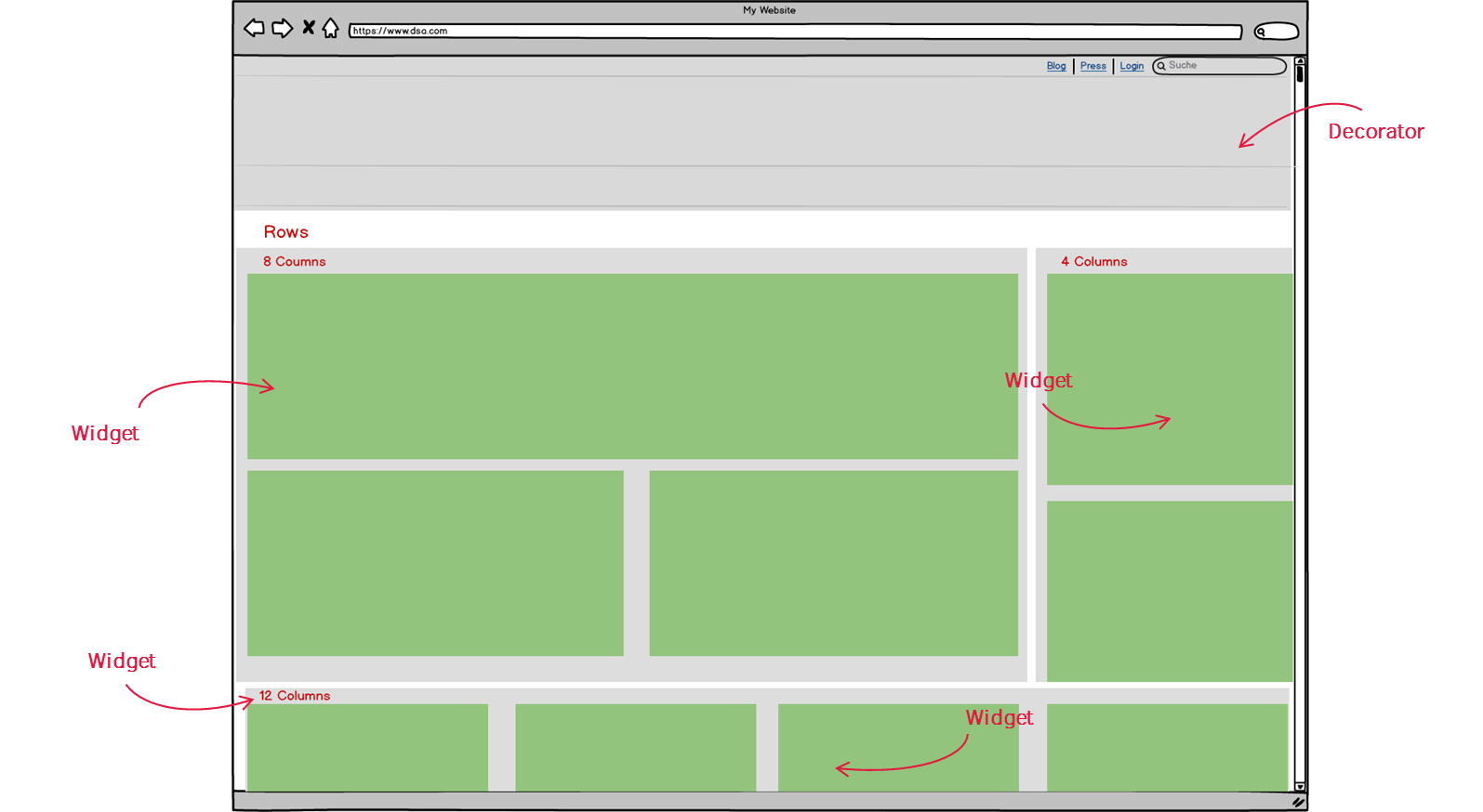
Scipio ERP uses fragments of reusable code to put together individual screens. Screens can range from HTML or XML responses to PDFs. The rendering is usually triggered by an event, such a request processed by the controller. A screen consists of:
- A Screen-Widget definition
- A “decorator“, that specifies standards in an overarching layout, including other widgets
- Multiple “Widgets” (Code fragments) that make up the inner content of a screen. These can be:
- Screen widgets
- Menu Widgets
- (Form Widgets)
Assuming that you’d want to generate a screen outlined in the image above (html response). Then you’d start by defining a screen widget in one of the screenwidget definition files within your component’s widget directory
Screens
From the perspective of the Scipio ERP framework, a screen is nothing more than a widget (a code fragment). Like all widgets, it can contain other widgets and result in a response object. The biggest difference is that Screens usually call on a decorator to style the surrounding screen.
<screens xmlns:xsi="http://www.w3.org/2001/XMLSchema-instance"
        xsi:noNamespaceSchemaLocation="http://ofbiz.apache.org/dtds/widget-screen.xsd">

       <screen name="EditExample">
        <section>
            <actions>
                <set field="titleProperty" value="PageTitleEditExample"/>
                <set field="tabButtonItem" value="EditExample"/>
                <set field="exampleId" from-field="parameters.exampleId"/>
                <entity-one entity-name="Example" value-field="example"/>
            </actions>
            <widgets>
                <decorator-screen name="CommonExampleDecorator" location="${parameters.mainDecoratorLocation}">
                    <decorator-section name="body">
                        <include-form name="EditExample" location="component://example/widget/example/ExampleForms.xml"/>
                    </decorator-section>
                </decorator-screen>
            </widgets>
        </section>
    </screen>

</screens>
The screen is seperated into sections, as of which each one can include actions, conditions & widgets – all set within their own container. Action definitions can be used to:
- set parameters
- use the service or entity engine to add additional information into the rendering context
- load label-resources (property-maps)
- run beanshell or groovy scripts
In short: they are meant to fill the context with additional, screen specific information.
Based on these information conditions can be set that allow you to either load widgets if all conditions are met, or load fail-widgets if they aren’t. A typical example would be a security check or a some information inside a table that change the content of the screen.
Lastly, the widget definitions set-up the screen itself. They can either contain widgets, call a decorator or run a freemarker script that will generate valid html.
Widgets
Widgets are fragments of code that basically deliver a response object. They can inherit one another and are styled by the screen they are contained in. They share the definition model with Screens, but do not rely on any additional decorator inclusions.
There are actually three different types of widgets: screenwidgets, menuwidgets and (less importantly) form-widgets. Their markup differs slightly, but the overall intention is the same: they are meant to generate a response object. Menuwidgets and formwidgets are somewhat special in this regard, as they do not necesarily include specific Freemarker files for generating the output. Instead their markup is directly converted within the renderer (widget-transforms). Additionally, they also allow auto-generation based on service or entity definitions. So if you used the service or entity engine to define your functions & tables, you are in luck: widgets can automatically generate a screen output based on these definitions. Please be aware, however, that due to the limitations on styling, we do not encourage the use of form-widgets throughout the software.
Decorator
A decorator is a widget which wraps the content of application pages and adds common elements (e.g. navigation, login, search, header, footer, etc.). Just like a screen, a decorator is also just a special type of widget. It differs in that it can also define decorator-sections, which serve as content containers that can be filled by screens. A good example of a decorator will look like this:
<screen name="SimpleDecorator">
        <section>
            <actions>
                <!-- The default (global) stylesheet -->
                <set field="layoutSettings.styleSheets[+0]" value="/images/maincss.css" global="true"/>
                <set field="layoutSettings.rtlStyleSheets[+0]" value="/images/mainrtl.css" global="true"/>
            </actions>
            <widgets>
                <!-- render header -->
                <platform-specific>
                    <html><html-template location="component://common/webcommon/includes/simple.ftl"/></html>
                    <xsl-fo><html-template location="component://common/webcommon/includes/simple.fo.ftl"/></xsl-fo>
                    <xml><html-template location="component://common/webcommon/includes/minimal-decorator.ftl"/></xml>
                </platform-specific>
            </widgets>
        </section>
    </screen>
Like screens and widgets, the decorators can also inherit other decorators and override specific parts. This concept is used from all applications inside SCIPIO ERP, where a common-decorator for basic inclusions to fill the context.