standard/htmlContent.ftl
The SCIPIO framework comes with a set of standard content elements. The elements are largely based on standard
html elements so the transition should be straight forward. Since all macros also standardize the html patterns,
it is recommended to rely on the SCIPIO tag alternatives for all html. All macros start with “<@”, so tags can
be converted by adding an @ in front of them.
The SCIPIO content elements add new options that can be added as attributes. For example, whereas <@table> will create a
default table, <@table responsive=true> will generate the very same with added resizing for smaller devices.
The available options and their respective use are outlined by this document.
Additionally, some already known attributes have been enhanced to make styling easier. As one example, classes are
automatically assigned based on the overarching theme. Additional classes can be set with the ‘class’ attribute.
However, the developer has the option to specify whether the classes should expand, or replace default values.
Included by htmlTemplate.ftl.
- May have implicit dependencies on other parts of Scipio API.
Heading
macro heading
An HTML heading (title).
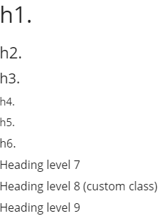
Usage Examples
<@heading>My Title</@heading>
Parameters
elemType |
(heading|h|p|span|div|raw|(boolean), default: heading)Element type boolean true means use default; false means none (same as “raw”). NOTE:
Do not specify h1-h6 here; use level argument instead.
|
title |
(string)alternative to nested content NOTE:
unlike nested, this will be explicitly html-escaped by the macro
|
level |
((int), default: -current global heading level-)Specific heading level If not specified, current heading level returned by #getCurrentHeadingLevel function is used. NOTE:
Does not consume a level.
|
relLevel |
((int), default: 0)Determines heading level by adding this number to current global heading level |
class |
((css-class))Heading element CSS classes Supports prefixes (see #compileClassArg for more info):
|
levelClassPrefix |
(default: "heading-level-")Prefix for level number class |
id |
Heading ID |
consumeLevel |
((boolean), default: false)Whether should consume a level in addition to printing a heading If true, the global heading level is set to (calculated level for this heading) + 1. NOTE:
this is better handled through use of the @section macro. Mostly useful for h1.
|
containerElemType |
(div|, default: -empty-)If present, adds container around title or this elem type |
containerClass |
((css-class))Container element CSS classes Supports prefixes (see #compileClassArg for more info):
|
containerId |
Container ID |
attribs |
((map))Extra legacy h1-h6 attributes Needed for names containing dashes. NOTE:
These are automatically HTML-escaped, but not escaped for javascript or other languages (caller responsible for these).
|
inlineAttribs... |
((inline-args))Extra legacy h1-h6 attributes NOTE:
camelCase names are automatically converted to dash-separated-lowercase-names. NOTE:
These are automatically HTML-escaped, but not escaped for javascript or other languages (caller responsible for these).
|
passArgs |
NOTE: This macro implements an advanced arguments interface supplementing
regular macro invocations. See standard/htmlTemplate for details.
Code Block
macro code
Creates a basic wrapper for code blocks.
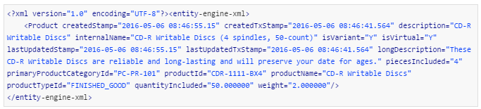
Usage Examples
    <@code type="java">
       // Some java code
    </@code>
Parameters
type |
(html|java|css|javascript|log, default:html) |
style |
Legacy HTML style attribute |
class |
((css-class))Heading element CSS classes Supports prefixes (see #compileClassArg for more info):
|
passArgs |
NOTE: This macro implements an advanced arguments interface supplementing
regular macro invocations. See standard/htmlTemplate for details.
mapOfbizFormTypeToTableType
function mapOfbizFormTypeToTableType
Maps an Ofbiz form widget type to a @table macro type.
Parameters
formType |
Responsive Table Script
macro tableResponsiveScript
Creates a responsive tables script (script only – no markup).
Parameters
enabled |
((boolean), default: true)Helper arg to prevent the whole macro from executing, when false |
tableId |
Table ID |
tableType |
Table type |
tableStyleName |
(default: -based on table type-)Table style name (optimization) Usually should be be omitted and will be determined automatically from table type. |
responsive |
((boolean), default: -from global styles-)If true, will generate a responsive table Currently, this relies on the jQuery plugin datatables.js (www.datatables.net) to generate responsive table. |
responsiveOptions |
((map))Map of options passed directly to responsive tables implementation (javascript implementation) |
responsiveDefaults |
((boolean), default: true)Fine-grained control for whether responsive defaults are looked up or not If true, responsive defaults are looked up, and any option in responsiveOptions overrides the defaults per-option; if false, no defaults are used and only |
scrollable |
((boolean), default: -from global styles-)Scrolling control (convenience parameter) If true, guarantees table will be scrollable horizontally. |
fixedColumnsLeft |
((integer))Number of columns that are fixed on the left-hand side (convenience parameter) Currently, alias for responsiveOptions.fixedColumns.leftColumns. |
fixedColumnsRight |
((integer))Number of columns that are fixed on the right hand side (convenience parameter) Currently, alias for responsiveOptions.fixedColumns.rightColumns. |
htmlwrap |
|
passArgs |
NOTE: This macro implements an advanced arguments interface supplementing
regular macro invocations. See standard/htmlTemplate for details.
Table
macro table
Defines a table with advanced generating functionality. Analogous to HTML <table> element.
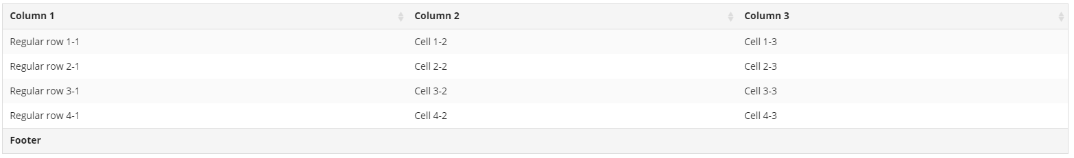
Required wrapper for all @table sub-element macros.
The generated menu ID following a call can be read using: getRequestVar("scipioLastTableInfo").id.
At current time (2016-09-16), other members of that map should not be relied upon.
Usage Examples
    <@table type="data-list" id="my-table">
      <@thead>
        <@tr>
          <@th width="15%">col 1</@th>
          <@th width="85%">col 2</@th>
        </@tr>
      </@thead>
      <@tbody>
        <@tr class="my-row-class" valign="middle">
          <@td>data value 1</@td>
          <@td>data value 2</@td>
        </@tr>
      </@tbody>
    </@table>
Parameters
General
type |
(generic|(theme-specific), default: generic)Table type STANDARD TYPESThese types must always be recognized by all styles themes:
DEFAULT STYLES TYPESThe following are recognized by Scipio standard markup:
NOTE:
These types are mainly targeted for backend applications.
|
class |
((css-class), default: -from global styles-)CSS classes Supports prefixes (see #compileClassArg for more info):
Defaults are looked up in global styles using: styles["table_" + type?replace("-","_")]
where type is the table type above. If the given style entry does not exist, the default is instead determined by: styles["table_default"]
|
id |
Table ID |
hasHeader |
((boolean))Hint to indicate that table is expected to have a header, normally a <@thead> element @table will try to figure this out on its own, but in some cases it may not be possible
|
autoAltRows |
((boolean), default: -from global styles-, fallback default: false) |
firstRowAlt |
((boolean), default: false) |
inheritAltRows |
((boolean))Only for nested tables: If true, all rows in nested tables will inherit alt from parent table row |
useFootAltRoots |
((boolean))Whether use alt row logic in foot or not |
cellspacing |
((int), default: -from global styles-, fallback default: -empty-)Traditional cellspacing Should be avoided in modern templates. |
open, close |
((boolean))Advanced structure control, for esoteric cases |
attribs |
((map))Other legacy <table> attributes Needed for names containing dashes. NOTE:
These are automatically HTML-escaped, but not escaped for javascript or other languages (caller responsible for these).
|
inlineAttribs... |
((inline-args))Other legacy <table> attributes and values NOTE:
camelCase names are automatically converted to dash-separated-lowercase-names. NOTE:
These are automatically HTML-escaped, but not escaped for javascript or other languages (caller responsible for these).
|
Responsive Tables
responsive, responsiveOptions, responsiveDefaults, scrollable, fixedColumnsLeft, fixedColumnsRight |
See @tableResponsiveScript macro for descriptions
NOTE:
@table with default markup will automatically disable responsive on tables that have no @thead element and hasHeader=true is not specified. Responsive tables may break when no header is present (may require a <thead> HTML element).
|
Other
useFootAltRows |
|
passArgs |
NOTE: This macro implements an advanced arguments interface supplementing
regular macro invocations. See standard/htmlTemplate for details.
Table header
macro thead
Defines a table header with advanced generating functionality. Analogous to HTML <thead> element.
Parameters
class |
|
id |
|
open |
|
close |
|
attribs |
|
passArgs |
NOTE: This macro implements an advanced arguments interface supplementing
regular macro invocations. See standard/htmlTemplate for details.
Table body
macro tbody
Defines a table body with advanced generating functionality. Analogous to HTML <tbody> element.
Parameters
class |
|
id |
|
open |
|
close |
|
attribs |
|
passArgs |
NOTE: This macro implements an advanced arguments interface supplementing
regular macro invocations. See standard/htmlTemplate for details.
Table footer
macro tfoot
Defines a table footer with advanced generating functionality. Analogous to HTML <tfoot> element.
Parameters
class |
|
id |
|
open |
|
close |
|
attribs |
|
passArgs |
NOTE: This macro implements an advanced arguments interface supplementing
regular macro invocations. See standard/htmlTemplate for details.
Table Row
macro tr
Helps define table rows. takes care of alt row styles. must have a parent @table wrapper.
Parameters
type |
(generic|content|meta|util, default: -dependent on table type-, fallback default: generic)
In complete absence of global styles, default is “generic”.
|
class |
((css-class))CSS classes Supports prefixes (see #compileClassArg for more info):
|
id |
Row ID |
useAlt |
((boolean))If specified, can manually enable/disable whether alternate row code runs per-row |
alt |
((boolean))If specified, override the automatic auto-alt styling to specific value true or false (manual mode) NOTE:
At current time, alt on non-body rows (except foot rows if enabled in @table) does not affect next row’s alt (unless groupLast used explicit on next) logic.
|
groupLast |
((boolean))If true, considers row logically grouped with last row Sets alt to exact same as last row. |
groupParent |
((boolean))Nested tables only, if true, considers row logically grouped with parent row Sets alt to exact same as parent row. |
selected |
((boolean), default: false)If specified and true marked as selected |
open, close |
((boolean))Advanced structure control, for esoteric cases |
attribs |
((map))Other legacy <tr> attributes Needed for names containing dashes. NOTE:
These are automatically HTML-escaped, but not escaped for javascript or other languages (caller responsible for these).
|
inlineAttribs... |
((inline-args))Other legacy <tr> attributes and values NOTE:
These are automatically HTML-escaped, but not escaped for javascript or other languages (caller responsible for these).
|
passArgs |
NOTE: This macro implements an advanced arguments interface supplementing
regular macro invocations. See standard/htmlTemplate for details.
Table Header Cell
macro th
Defines a table header cell. Analogous to <th> HTML element.
Parameters
class |
((css-class))CSS classes Supports prefixes (see #compileClassArg for more info):
|
id |
Cell ID |
open, close |
((boolean))Advanced structure control, for esoteric cases |
attribs |
((map))Other legacy <th> and <td> attributes Needed for names containing dashes. NOTE:
These are automatically HTML-escaped, but not escaped for javascript or other languages (caller responsible for these).
|
inlineAttribs... |
((inline-args))Other legacy <th> and <td> attributes and values NOTE:
These are automatically HTML-escaped, but not escaped for javascript or other languages (caller responsible for these).
|
passArgs |
NOTE: This macro implements an advanced arguments interface supplementing
regular macro invocations. See standard/htmlTemplate for details.
Table Body Cell
macro td
Defines a table body cell. Analogous to <td> HTML element.
Table Row Class Attribute String
macro tableRowClassAttribStr
(DEPRECATED)
Helps build common data/table row class string (odd, even, etc.). Common pattern (in stock Ofbiz templates).
DEPRECATED: use @table, @tr macros instead.
Usage Examples
<tr<@tableRowClassAttribStr class="myClass" alt=false/>>
Parameters
class |
((css-class))CSS classes Supports prefixes (see #compileClassArg for more info):
|
alt |
((boolean), default: false)If true is alternate row (odd), if false regular (even) |
selected |
((boolean), default: false)If true marked as selected |
passArgs |
NOTE: This macro implements an advanced arguments interface supplementing
regular macro invocations. See standard/htmlTemplate for details.
Pricing table wrapper
macro pul
Creates a pricing table wrapper.
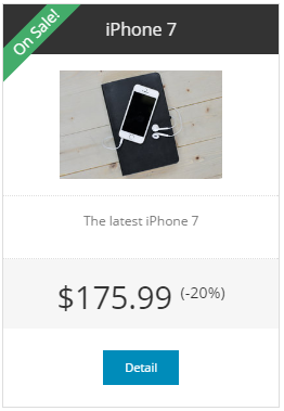
Since this is very foundation specific, this function may be dropped in future installations.
Usage Examples
    <@pul>
        <@pli>Text or <a href="">Anchor</a></@pli>
    </@pul>
Parameters
title |
Fieldset title |
passArgs |
NOTE: This macro implements an advanced arguments interface supplementing
regular macro invocations. See standard/htmlTemplate for details.
Pricing table element
macro pli
Creates a pricing table element/entry.
Since this is very foundation specific, this function may be dropped in future installations.
Parameters
type |
((string) price|description|title|button|ribbon, default:-empty-) |
class |
((css-class))CSS classes Supports prefixes (see #compileClassArg for more info):
|
passArgs |
NOTE: This macro implements an advanced arguments interface supplementing
regular macro invocations. See standard/htmlTemplate for details.
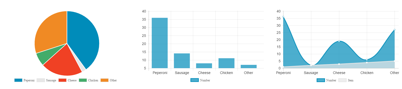
Chart
macro chart
Creates a chart wrapper.
Libraries used:
Foundation Pizza: http://zurb.com/playground/pizza-amore-charts-and-graphs (customization through _base.scss) – deprecated
Chart.js: http://www.chartjs.org/docs/ (customization through _charsjs.scss)
Usage Examples
    <@chart type="bar" >
        <@chartdata value="36" title="Peperoni"/>
    </@chart>
Parameters
type |
(pie|bar|line, default: pie) |
library |
(foundation|chart, default: chart)Uses either chart.js or foundation. “foundation” is deprecated and requires additional seed data in order to run. |
id |
chart ID |
title |
((string), default: -empty-)Data Title |
xlabel |
X-axis label |
ylabel |
Y-axis label |
label1 |
Dataset 1 label |
label2 |
Dataset 2 label |
labelUom1 |
Dataset 1 currency symbol (automatically added to the tooltips) |
labelUom2 |
Dataset 2 currency symbol (automatically added to the tooltips) |
passArgs |
NOTE: This macro implements an advanced arguments interface supplementing
regular macro invocations. See standard/htmlTemplate for details.
chart_get_number_of_datasets
function chart_get_number_of_datasets
Gets chart number of datasets.
Parameters
content |
(pie|bar|line, default: pie) |
library |
(foundation|chart, default: chart) |
Chart data
macro chartdata
Chart data entry.
value and value2 should be passed as numbers, NOT as strings. For backward-compatibilityreasons, if you pass a string, it will be printed out in javascript without enclosing quotes (it is assumed
to be a Javascript-valid number), which may not be secure or portable, depending on the data sources!
Parameters
title |
|
value |
|
value2 |
|
passArgs |
NOTE: This macro implements an advanced arguments interface supplementing
regular macro invocations. See standard/htmlTemplate for details.
Slider
macro slider
Creates a slider wrapper.

Usage Examples
    <@slider>
        <@slide title="" image="" link="/myUrl.html">
            // content
        </@slide>
    </@slide>
Parameters
title |
((string), default: -empty-)Data Title |
id |
((string), default: -empty-)Slider id |
class |
((css-class))Heading element CSS classes Supports prefixes (see #compileClassArg for more info):
|
library |
(|owl|slick, default: -empty-)Uses either Owl carousel, Slick or foundation orbit. “owl” & “slick” require additional seed data in order to run. |
controls |
((boolean), default: true)Left / Right navigation |
indicator |
((boolean), default: true)Bullet indicators |
jsOptions |
(string)Additional js argument, included on js initialization WARN:
As a string, because this contains whole javascript code, this is not currently js-escaped by the macro. Caller is responsible for escaping this param!
|
passArgs |
NOTE: This macro implements an advanced arguments interface supplementing
regular macro invocations. See standard/htmlTemplate for details.
Slide
macro slide
Slider data entry – a single slide.
Usage Examples
    <@slide title="Slide #1" image="">
       // content
    </@tile>
Parameters
title |
((string), default: -empty-)Data Title |
class |
((css-class))CSS classes Supports prefixes (see #compileClassArg for more info):
|
id |
slide ID |
library |
(|owl|slick, default: -empty-)Uses either Owl carousel, Slick or foundation orbit. “owl” & “slick” require additional seed data in order to run. |
link |
Link URL around nested content
WARN:
can only use if no other links inside nested content NOTE:
This parameter is automatically (re-)escaped for HTML and javascript (using #escapeFullUrl or equivalent) to help prevent injection, as it is high-risk. It accepts pre-escaped query string delimiters for compatibility, but other characters should not be manually escaped (apart from URL parameter encoding).
|
linkTarget |
(|_blank|(boolean)|..., default: -from global styles-, fallback default: -empty-)Target for link element If boolean, false prevents any; true will allow global styles hash lookup. |
image |
Background image URL |
responsiveMap |
((map))Map of options passed directly to responsive image implementation |
passArgs |
NOTE: This macro implements an advanced arguments interface supplementing
regular macro invocations. See standard/htmlTemplate for details.
img
macro img
Image tag – eases the positioning/styling of images with inline styles. Uses https://www.w3.org/TR/css3-images/#the-object-fit .
Relies on custom scipioObjectFit Javascript function as a fallback for IE.

Usage Examples
<@img src="..." type="cover" height="" width=""/>
Parameters
src |
(string)image location WARN:
At current time, do not pass unsanitized input for this parameter; escaping not implemented If you must use user input in src, do not use this macro for time being (expect escaping to be applied later).
|
responsiveMap |
((map))Map of options passed directly to responsive image implementation |
class |
((css-class))CSS classes Supports prefixes (see #compileClassArg for more info):
|
id |
Image ID, added to wrapping container |
type |
(none|fill|cover|contain|scale-down|bg-cover, default: cover)
|
link |
Link URL around nested content
WARN:
2016-10-10: Do not pass any unsafe input in this link at this time! Escaping protection is only partial (html but not css). WARN:
can only use if no other links inside nested content NOTE:
This parameter is automatically (re-)escaped for HTML and javascript (using #escapeFullUrl or equivalent) to help prevent injection, as it is high-risk. It accepts pre-escaped query string delimiters for compatibility, but other characters should not be manually escaped (apart from URL parameter encoding).
|
linkTarget |
(|_blank|(boolean)|..., default: -from global styles-, fallback default: -empty-)Target for link element If boolean, false prevents any; true will allow global styles hash lookup. |
width |
(string)container width, e.g. “12px” – acts as a max-width |
height |
(string)container height e.g. “12px” – acts as a max-height |
passArgs |
NOTE: This macro implements an advanced arguments interface supplementing
regular macro invocations. See standard/htmlTemplate for details.
Tabs
macro tabs
Creates a content block that is organized by tabs. First element is always set to active. Not to be confused with @menu of type “tab”, which does not wrap the content in a container.
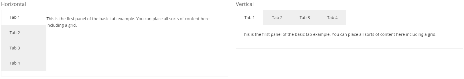
Usage Examples
    <@tabs type="">
        <@tab title="First Tab">
            // content
        </@tab>
        <@tab title="Second Tab">
            // content
        </@tab>
    </@tabs>
Parameters
type |
(vertical|horizontal, default: horizontal) |
title |
Title |
id |
ID for outermost container |
class |
((css-class))CSS classes or additional classes for outermost container Supports prefixes (see #compileClassArg for more info):
|
passArgs |
NOTE: This macro implements an advanced arguments interface supplementing
regular macro invocations. See standard/htmlTemplate for details.
History
Added for 1.14.3
Tab element
macro tab
Creates a tab element/entry.
Parameters
title |
Title |
id |
ID for outermost container |
class |
((css-class))CSS classes or additional classes for outermost container Supports prefixes (see #compileClassArg for more info):
|
passArgs |
NOTE: This macro implements an advanced arguments interface supplementing
regular macro invocations. See standard/htmlTemplate for details.
QRCode
macro qrcode
Creates a QR Code image link.
Usage Examples
<@qrcode text="" />
Parameters
id |
ID for outermost container |
class |
((css-class))CSS classes or additional classes for outermost container Supports prefixes (see #compileClassArg for more info):
|
text |
(string)Text or Target URL (will be url-encoded) |
logo |
((boolean|string), default: false)Render overlaying logo on top of qrcode? Can be boolean true/false (for default logo) or a file location (component://). |
export |
((string) image|link|url, default: image)Export as image or link |
width |
((integer))QRCode width Default configured in |
height |
((integer))QRCode height Default configured in |
ecLevel |
(L|M|Q|H, default: -from qrcode.properties-)Error correction level |
linktext |
((string))link text |
alt |
((string))alt text (default: “QRCode”) |
targetUri |
((string), default: qrcode)Target controller request |
format |
(png|jpg|bmp, default: -from qrcode.properties-)Image format |
logoSize |
((string), default: -not set; use logo natural size-)Logo dimensions in pixels or percent If specified with “%” sign, (50%, 100%), adjusts relative to image size; NOTE:
This option NEVER changes the aspect ratio of the logo, even if two pixel dimensions given; it simply tries to make it best fit within requested square. Examples: 100% (very useful), 50%, 80x20, 50%x50%, 100 50%w, 50%h, 30w, 30h (explicit dimensions)
|
logoMaxSize |
((string), default: -none-)Logo max dimensions Max dimensions for the logo. Supports similar syntax as logoSize. 100% (very useful)
|
passArgs |
NOTE: This macro implements an advanced arguments interface supplementing
regular macro invocations. See standard/htmlTemplate for details.