standard/htmlStructure.ftl
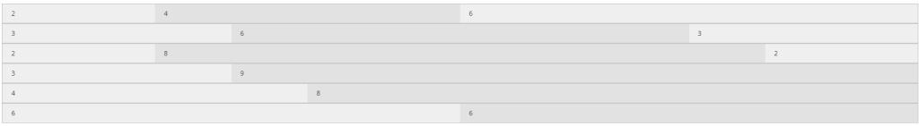
Displaying content within a (flexible) grid is a way of structuring content on a website.
The grid itself works as a layer on top of the basic html structure. Everything visible is grouped inside
columns and individual cells. The SCIPIO framework uses the standard 12 column grid that is used by
modern CSS frameworks, such as foundation or bootstrap.
This template contains structural code (grid, tile, etc.) that is used by all SCIPIO standard HTML markup.
Included by htmlTemplate.ftl.
- May have implicit dependencies on other parts of Scipio API.
Definitions:
cell,
container,
evalAbsContainerSizeFactors,
grid,
parseContainerSizesFromStyleStr,
row,
section,
tile
Container
macro container
Simple container (whether used as grid element or not); basically macro version of HTML div element.
This serves to add various hooks that may be needed around regular containers.
Parameters
class |
((css-class))CSS classes Supports prefixes (see #compileClassArg for more info):
NOTE:
This type of element is expected to have no default classes.
|
id |
Container ID |
attribs |
((map))Other attributes for div Needed for names containing dashes. NOTE:
These are automatically HTML-escaped, but not escaped for javascript or other languages (caller responsible for these).
|
inlineAttribs... |
((inline-args))Extra attributes for div NOTE:
camelCase names are automatically converted to dash-separated-lowercase-names. NOTE:
These are automatically HTML-escaped, but not escaped for javascript or other languages (caller responsible for these).
|
open |
|
close |
|
elem |
|
passArgs |
NOTE: This macro implements an advanced arguments interface supplementing
regular macro invocations. See standard/htmlTemplate for details.
Row
macro row
Creates a grid row.
Usage Examples
    <@row attr="" >
        <@cell attr=""/>
    </@row>
Parameters
class |
((css-class))CSS classes Supports prefixes (see #compileClassArg for more info):
|
alt |
((boolean), default: false)If true alternate row (odd), if false regular (even) |
id |
Row ID |
style |
Legacy HTML style attribute |
selected |
((boolean), default: false)If true row is marked selected |
attribs |
((map))Extra attributes Needed for names containing dashes. NOTE:
These are automatically HTML-escaped, but not escaped for javascript or other languages (caller responsible for these).
|
inlineAttribs... |
((inline-args))Extra attributes NOTE:
camelCase names are automatically converted to dash-separated-lowercase-names. NOTE:
These are automatically HTML-escaped, but not escaped for javascript or other languages (caller responsible for these).
|
collapse |
|
norows |
|
open |
|
close |
|
passArgs |
NOTE: This macro implements an advanced arguments interface supplementing
regular macro invocations. See standard/htmlTemplate for details.
Cell
macro cell
Creates a grid cell.
Usage Examples
    <@row attr="" >
        <@cell attr="">
            cell content goes in here!
        </@cell>
    </@row>

    <@row>
        <@cell>
            cell content goes in here!
        </@cell>
    </@row>

    <@row>
        <@cell columns=3>
            cell content goes in here!
        </@cell>
    </@row>

    <@row>
        <@cell columns=3 small=2 class="+my-cell">
            cell content goes in here!
        </@cell>
    </@row>
Parameters
class |
((css-class))CSS classes Supports prefixes (see #compileClassArg for more info):
|
id |
Cell ID |
style |
Legacy HTML style attribute |
columns |
((int), default: 12)Expected number of columns to be rendered Default only used if class empty and no column sizes specified. |
small |
((int))Specific number of small columns, overrides small part general columns value above |
large |
((int))Specific number of large columns, overrides large part of general columns value above |
medium |
((int))Specific number of medium columns, overrides medium part of general columns value above |
offset |
((int))Offset in number of columns |
smallOffset |
((int))Specific offset for small columns |
mediumOffset |
((int))Specific offset for medium columns |
largeOffset |
((int))Specific offset for large columns |
last |
((boolean))If true indicates last cell in row NOTE:
This is often optional in CSS frameworks; affects float alignment.
|
attribs |
((map))Extra attributes Needed for names containing dashes. NOTE:
These are automatically HTML-escaped, but not escaped for javascript or other languages (caller responsible for these).
|
inlineAttribs... |
((inline-args))Extra attributes NOTE:
camelCase names are automatically converted to dash-separated-lowercase-names. NOTE:
These are automatically HTML-escaped, but not escaped for javascript or other languages (caller responsible for these).
|
collapse |
|
nocells |
|
open |
|
close |
|
passArgs |
NOTE: This macro implements an advanced arguments interface supplementing
regular macro invocations. See standard/htmlTemplate for details.
parseContainerSizesFromStyleStr
function parseContainerSizesFromStyleStr
(override)
OVERRIDE. Parses container sizes from a class/style string.
Container size method overrides
These provide framework-/theme-specific overriding implementations of the placeholder functions of the
saveCurrentContainerSizes and related utilities lib functions.
- Implementation of evalAbsContainerSizeFactors assumes all max sizes for large/medium/small are the same.
- catchArgs… is in case of interface changes. Not used.
Parameters
style |
|
catchArgs... |
evalAbsContainerSizeFactors
function evalAbsContainerSizeFactors
(override)
OVERRIDE for: utilities#evalAbsContainerSizeFactors. Calculates nested container size factors.
Parameters
sizesList |
|
maxSizes |
|
cachedFactorsList |
|
catchArgs... |
Grid List
macro grid
Creates a grid list.
Usage Examples
    <@grid>
        <li>Text or <a href="">Anchor</a></li>
    </@grid>
Parameters
class |
((css-class))CSS classes Supports prefixes (see #compileClassArg for more info):
|
columns |
((int), default: 5)Number of columns |
type |
(tiles|list|, default: list) |
tilesType |
Default tiles type for tiles inside this element
This same value is used as default for the @tile macro “type” attrib. |
id |
|
passArgs |
NOTE: This macro implements an advanced arguments interface supplementing
regular macro invocations. See standard/htmlTemplate for details.
Tile
macro tile
Creates a very basic wrapper for tiles (can be used in metro designs).
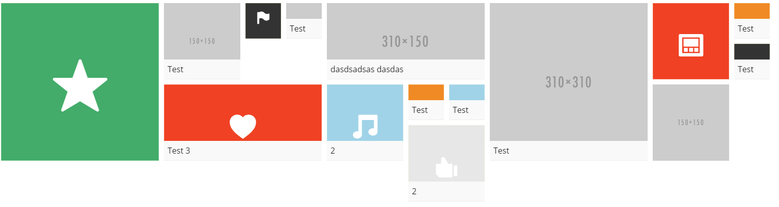
Please be aware that this is neither based on standard bootstrap, nor foundation.
It is loosely based on http://metroui.org.ua/tiles.html
Usage Examples
    <@tile size="small">
       // content
    </@tile>
Parameters
type |
(default|generic|(theme-specific), default: -inherited from tilesType on @grid element-)
Provides a set of defaults for the other parameters (size, color, etc.) via global styles hash (as “tile_xxx” where xxx is type).
|
size |
(small|normal|wide|large|big|super, default: normal)Tile size specifier |
title |
Title |
titleType |
(|default|..., default: default)Title type. Used to determine style Currently only “default” supported. |
titleBgColor |
(none|0|1|2|3|4|5|6|7|..., default: -from global styles-, fallback default: 0)
|
class |
((css-class))CSS classes Supports prefixes (see #compileClassArg for more info):
|
link |
Link URL around nested content
WARN:
can only use if no other links inside nested content
|
linkTarget |
(|_blank|(boolean)|..., default: -from global styles-, fallback default: -empty-)Target for link element If boolean, false prevents any; true will allow global styles hash lookup. |
id |
Field ID |
color |
(none|0|1|2|3|4|5|6|7|..., default: -from global styles-, fallback default: 0)
|
icon |
Icon code (http://zurb.com/playground/foundation-icon-fonts-3) |
image |
Background image URL (icon won’t be shown if not empty)
WARN:
2016-10-10: Do not pass any unsafe input in this link at this time! Escaping protection is only partial (html but not css).
|
imageType |
(|default|..., default: default)Image type for styling Scipio standard supported types (extensible by theme):
Type style is looked up as: styles[“type_image_” + imageType?replace(“-“,”_”)]. |
imageBgColor |
(none|0|1|2|3|4|5|6|7|..., default: -from global styles-, fallback default: none)
|
overlayType |
(|default|..., default: default)Overlay type Scipio standard supported types (extensible by theme):
Type style is looked up as: styles[“type_overlay_” + overlayType?replace(“-“,”_”)]. |
overlayBgColor |
(none|0|1|2|3|4|5|6|7|..., default: -from global styles-, fallback default: 0)
|
passArgs |
NOTE: This macro implements an advanced arguments interface supplementing
regular macro invocations. See standard/htmlTemplate for details.
Section
macro section
Creates a logical section with optional title and menu.
Automatically handles heading sizes and keeps track of section nesting for the whole rendering request, even across screens.render calls.
Use getCurrentHeadingLevel and getCurrentSectionLevel functions if need to get current
levels manually, but most often should let @section menu handle the level calculations.
This has dependencies on some non-structural macros.
Usage Examples
    <@section attr="">
        Inner Content
    </@section>
Parameters
type |
(default|generic|..., default: default)
Scipio standard currently only defines |
id |
Section ID, on outermost container and used as prefix for other element IDs
NOTE:
By convention (and for compability) this will always be on the outermost container.
|
containerId |
Section ID, on outermost container only (special case of id)
Unlike |
contentId |
Explicit ID for inner content container |
containerClass |
((css-class))CSS classes, on outermost container Supports prefixes (see #compileClassArg for more info):
|
cellClass |
((css-class))CSS classes, on outer cell element (affects title) (NOT on outermost container) Supports prefixes (see #compileClassArg for more info):
NOTE:
boolean false has no effect here NOTE:
Grid size classes may be specified here to limit dimensions.
|
class |
((css-class))CSS classes, on outer cell element (alias for cellClass) |
contentClass |
((css-class))CSS classes, on inner content container |
containerStyle |
Legacy HTML style attribute, on outermost container |
style |
Legacy HTML style attribute, on outermost container (alias for containerStyle) |
contentStyle |
Legacy HTML style attribute, on inner content container |
containerAttribs |
((map))Extra attributes, on outer container |
attribs |
((map))Extra attributes, on outer container (alias for containerAttribs) |
contentAttribs |
((map))Extra attributes, on inner content container |
title |
Section title |
titleClass |
((css-class))Section title class Supports complex expressions (rarely needed; usually headingLevel enough). |
padded |
((boolean), default: false) |
autoHeadingLevel |
((boolean), default: true)Auto increase heading level when title present |
headingLevel |
((int))Force this heading level for title. if autoHeadingLevel true, also influences nested elems (even if no title here, but if no title won’t consume a size) |
relHeadingLevel |
((int))Increase heading level by this number |
defaultHeadingLevel |
((int))Default heading level (same as headingLevel if autoHeadingLevel false) If empty string, use getDefaultHeadingLevel() |
menuContent |
((macro)|(map)|(string))(optional) A macro, map of @menu args, or string html markup of li elements only defining a menu
NOTE:
Not escaped by macro.
|
menuLayoutTitle |
(post-title|pre-title|inline-title, default: -from global styles-, fallback default: post-title)
This is a low-level control; avoid where possible. |
menuLayoutGeneral |
(top|bottom|top-bottom, default: -from global styles-, fallback default: top) |
titleContainerClass |
((css-class), default: -from global styles-)(optional) CSS classes, for title container NOTE:
if the argument results in no class specified, the container is omitted.
|
menuContainerClass |
((css-class), default: -from global styles-)(optional) CSS classes, for menu container NOTE:
if the argument results in no class specified, the container is omitted.
|
menuTitleContainerClass |
((css-class), default: -from global styles-)(optional) CSS classes, for menu and title (combined) container NOTE:
if the argument results in no class specified, the container is omitted.
|
menuRole |
(nav-menu|paginate-menu, default: nav-menu) |
menuClass |
((css-class))(optional) CSS classes, extra menu classes Supports prefixes (see #compileClassArg for more info):
This is a low-level control; avoid where possible. |
menuId |
Explicit ID for menu |
requireMenu |
((boolean), default: false)If true, add menu elem even if empty |
forceEmptyMenu |
((boolean), default: false)If true, always add menu and must be empty |
menuItemsInlined |
((boolean), default: -auto-)Override flag to say if menuContent string contains menu items only or also the menu wrapper If this is omitted (or empty string), it tries to determine automatically from the string. NOTE:
This only applies if menuContent is a string.
|
hasContent |
((boolean), default: true)Optional content hint When false, will add classes to indicate content is empty or treat as logically empty |
open |
|
close |
|
passArgs |
NOTE: This macro implements an advanced arguments interface supplementing
regular macro invocations. See standard/htmlTemplate for details.
History
Enhanced/standardized for 1.14.2.